Intuitive Kibana Dashboards for Microsoft Teams User Metrics at your Fingertips
Microsoft Teams Monitoring
It is no secret that for IT teams, troubleshooting Microsoft 365 or Microsoft Teams issues takes time, and more often than not, the culprit is not even Microsoft.
Martello’s Vantage DX Includes Elastic’s Kibana Software
As you know, Kibana is a free and open user interface that lets you visualize and navigate data. The latest release of Martello’s Vantage DX now includes Elastic’s Kibana software including unlimited data visualizations and customizations (dashboards). These intuitive Kibana charts and reports can be used to interactively navigate through large amounts of deep data. Built-in aggregations and filters also allow you to easily surface important data such as ‘Top 10’ queries, histograms and trends. This data can also be easily shared or exported to other team members or departments so they can view and analyze data using their web browser.
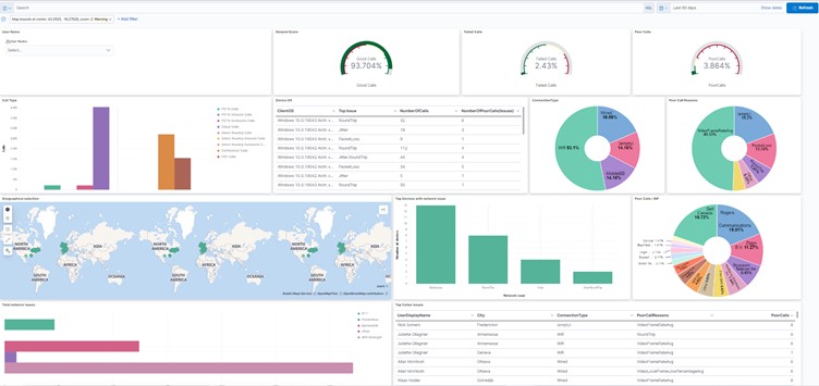 Image: Sample Microsoft Teams Dashboard
As you can see from the image above, this upgrade to Vantage DX means that IT teams can have a specific Microsoft Teams dashboard (created in Kibana) to help consolidate all the data specific to the user into one visualization. Using this dashboard allows IT to quickly understand the issues impacting the user’s experience. Having this current, accurate and reliable data in a single pane of glass empowers IT to be more productive as they can now quickly resolve issues and have easy access to histograms, line graphs, pie charts, heat maps, gauges, goals, metrics and more. The end result is an improved end user’s experience.
Looking for more content on dashboards? Read our latest blogs to get concrete use case examples:
- How to Use the Key Performance Metrics you Already Have to Improve the Microsoft Teams User Experience.
- The Who, What and Where of Delivering Microsoft Teams Mobile Voice Service Quality.
Interested in seeing Vantage DX in action? Book a demo today.